The goal of the project was to modernize the interface for the call center employees to result in an improved employee customer experience along with reducing average call time. The current outdated and cluttered system is used by the associates when they are on a call with a customer to pull up relevant information and complete the customer's requests.
YEAR
2021 (six weeks)
PLATFORM
Figma, Mural
During summer 2021, I spend a majority of my time on a team working to redesign an internal customer service associate portal interface for a global investment management firm.
The objectives of the project were to map out the existing user experience to understand how it’s used and what the user needs are, come up with a new approach and design of the system, and finally develop a future roadmap for implementation.
We followed a very iterative and communicative design process. Speaking with the client twice a week enabled us to review the decisions with the stakeholders and refine based on their feedback. At various points throughout the envisioning project, we communicated with the developers to ensure our designs were within the technical limitations.
In the end, we delivered an extensive rebranded visual design system style guide with a focus on accessibility, in addition to a number of low and high fidelity user-centric wireframes. On top of that, we produced a number of future and current state journey maps to better understand and present the user needs.
Discovery Stage
After a number of sessions speaking with the users, their sentiments and comments regarding the existing system were visualized in a few forms. Below is an example of an experience diagram which outlines various actions an agent took before, during, and after a call. It also shows the positive and negative aspects of the process. Furthermore, we worked with the stakeholders to create an empathy map. The quadrants are labeled Says, Thinks, Feels, and Does.
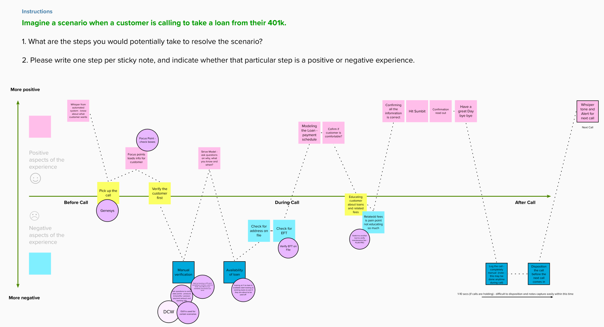
Experience diagram
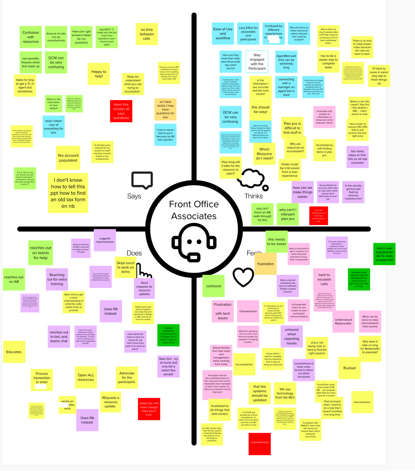
Empathy map
Eventually we broke down, organized, and restructured these resources into a format that was translatable between current and future state, as well as organized around a call quality framework that’s used internally to train call associates for how to communicate best—which is called the STRIVE Model. Finally, we created 4 current state and 2 future state journey maps of various scenarios as a combination of the information we gathered. One current and one future state map can be found below.
We started off with a sentiment flow at the top, and then chose goals, actions, pain points, and quotes from the workshops. This really outlined and broke down the process an associate goes through on a typical call.
Making these maps enabled us to truly understand how the customer service associates were feeling and acting at various stages of calls with customers. We were able to make sense of the data we collected to better inform the wireframes and rationalize the design solutions when it came to making the metrics page.
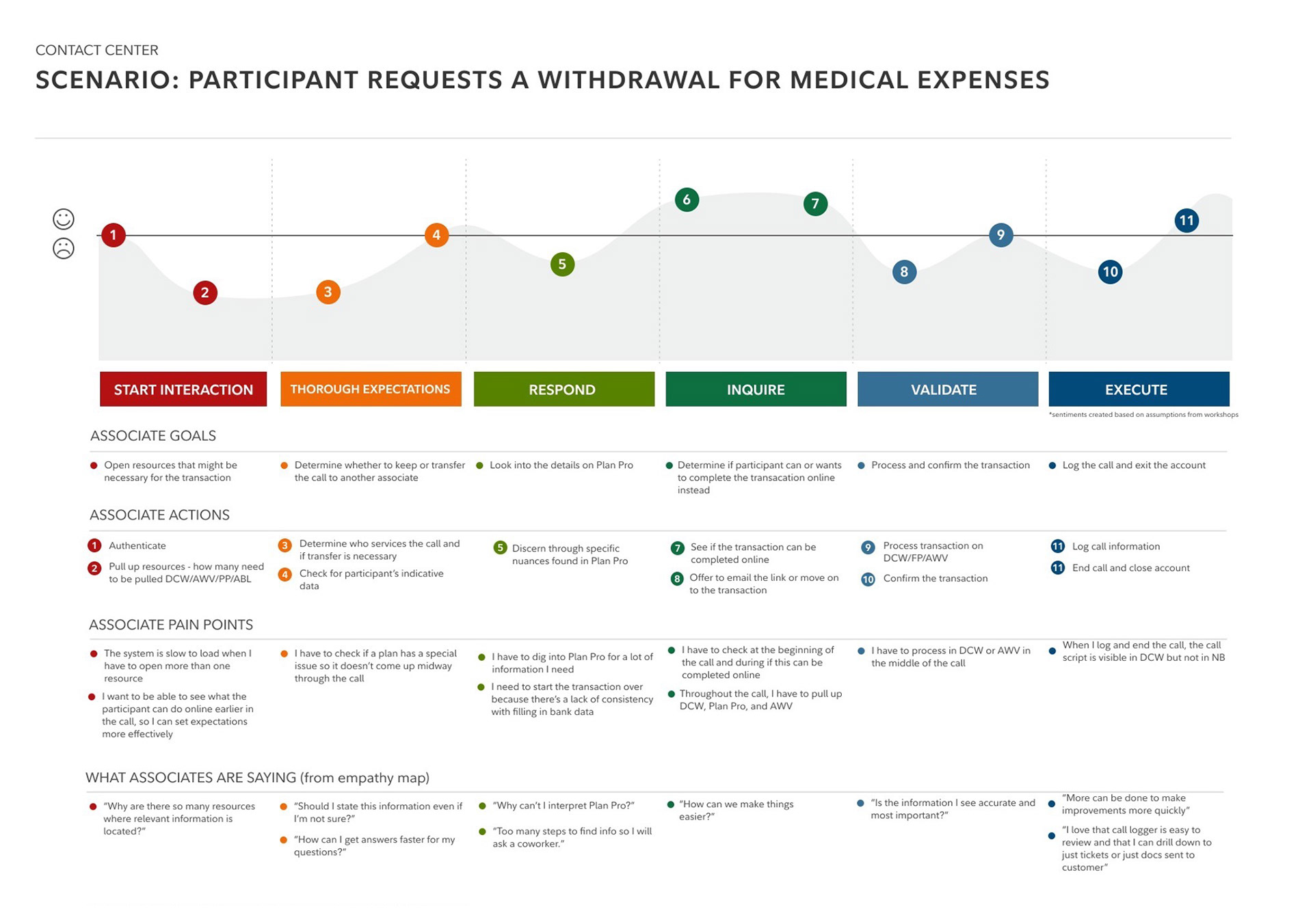
Current state journey map
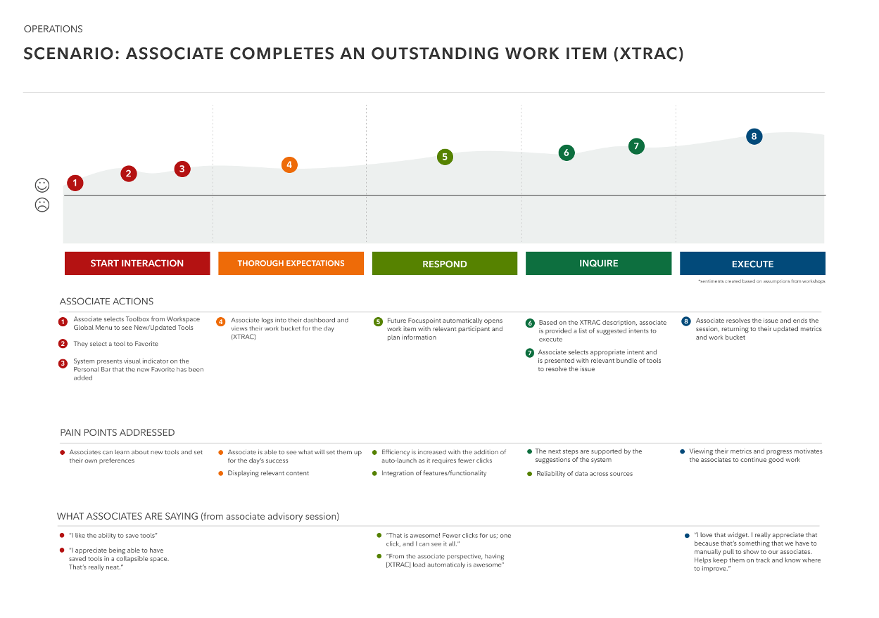
Future state journey map
EXISTING PROBLEMS
Following the discovery stage, we uncovered a range of problems with the existing system. Below is a screenshot of the metrics page, but the other pages in the system were even worse believe it or not.
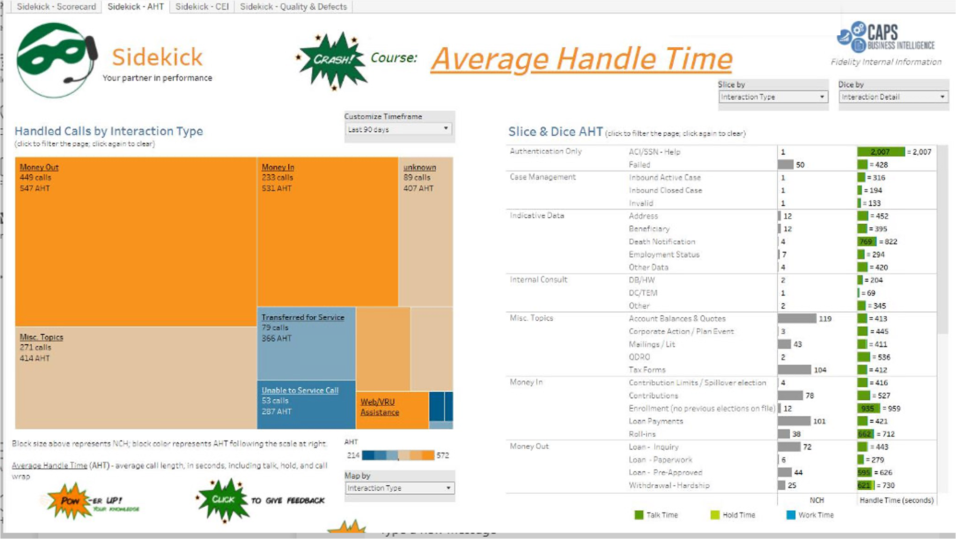
Existing/outdated metrics page
Dated System: Inefficient, cluttered, unintuitive interface needed to be redesigned to reduce burden on the associates and enable them to answer calls in a timely and stress-free manner
Lack of Customization: Associates forced to work within the predetermined organization of apps and tools on the screen. Certain tools are used less frequently than others but take up a lot of real estate on the screen
Difficulty for New Joiners: Challenging learning curve for all of the 130+ features and applications integrated into the system
Stressful Work Environment: Associates have to spend more time during and after calls than needed as they record required post-call summaries and notes
Poor Usability: Too many clicks required to complete actions and difficult to find certain frequently used pieces of customer data
Lack of Automation: System depends fully on associates determining the intent of the customer and what steps/tools are required to resolve the issue.
metrics page Wireframes
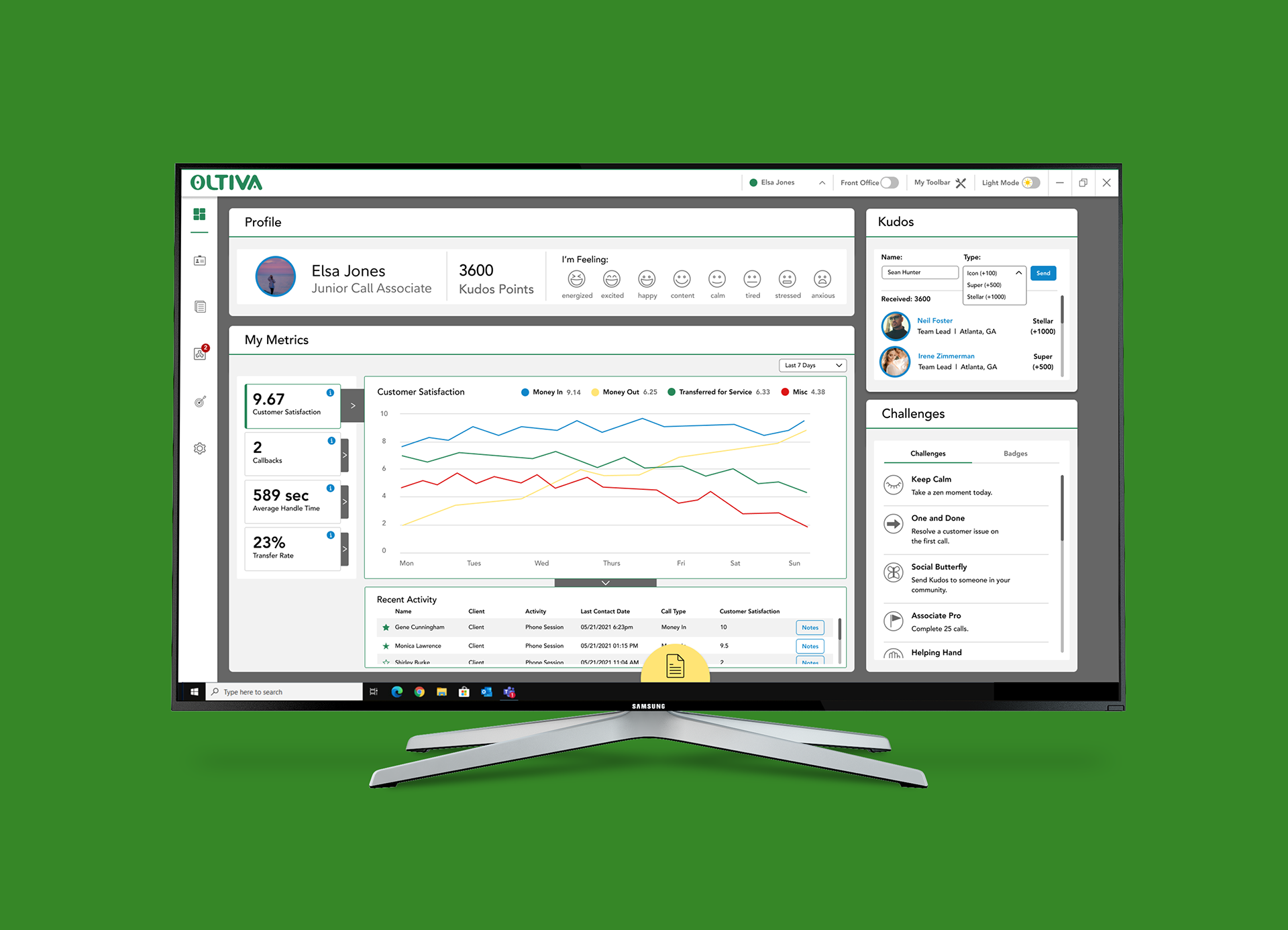
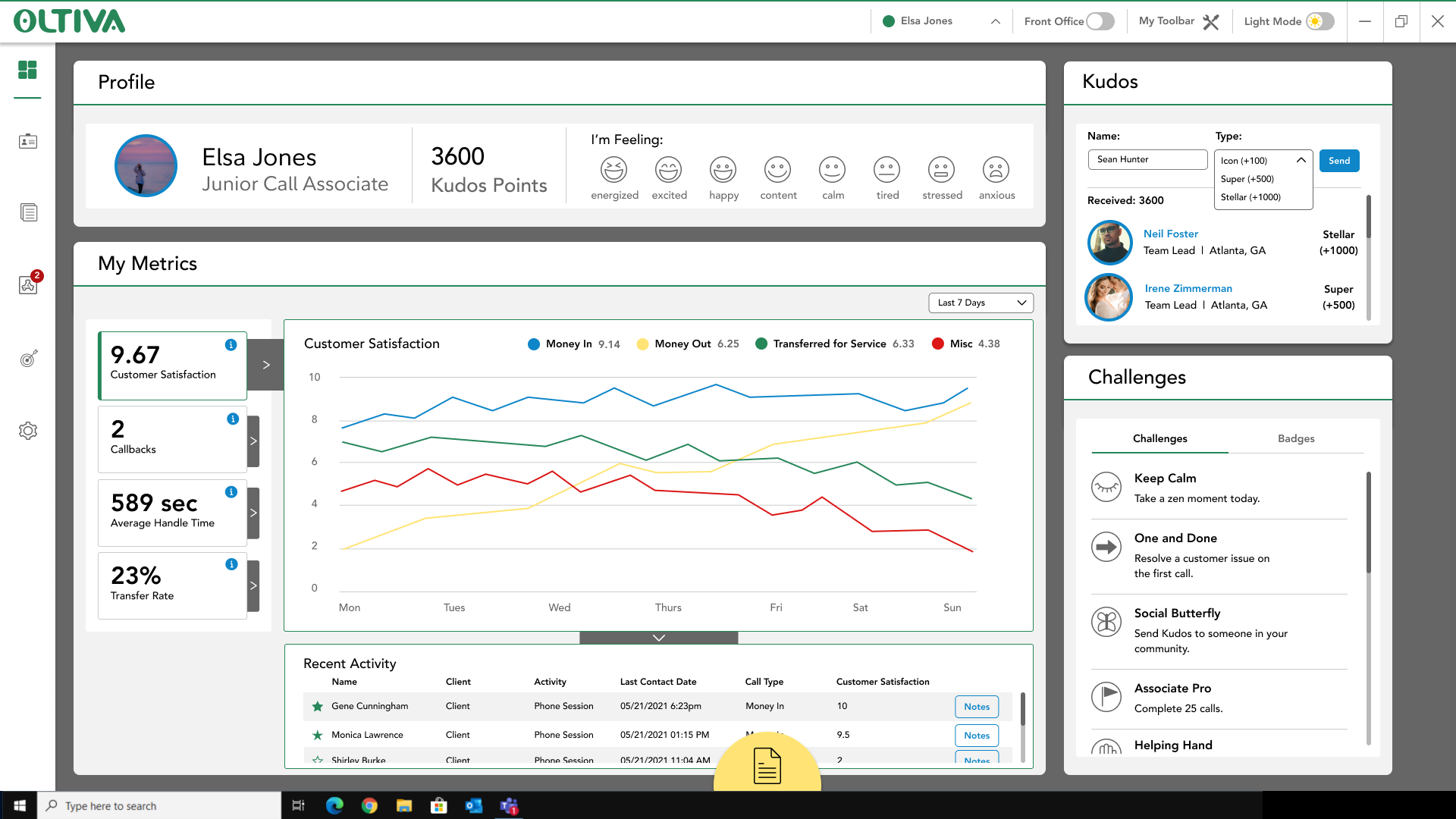
A bulk of the time on the project was spend iterating on the wireframes of the updated metrics page. The overall goal was to provide a personal experience for the associate where they can get a pulse on how they are feeling, performing, and engaging.
When redesigning the pages, we were looking for a way to create a new way to see metrics from the user perspective to increase the readability and experience of the metrics page while also adding a light hearted and gamified community aspect to encourage teamwork.
To meet these goals, we divided the workspace into three main sections: sentiment check-in (top), community (right), and metrics (main).
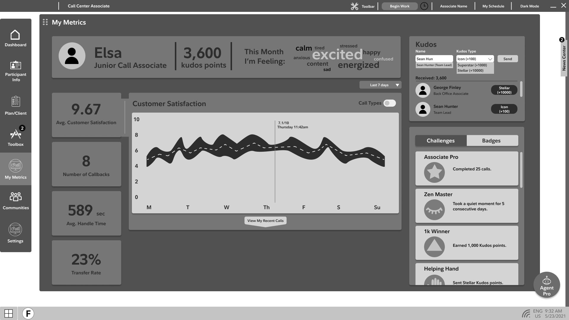
In the top section, we were looking for a way promote and be mindful of associate wellbeing. We created a system for them to quickly check in regarding their emotions. They have the option to select an emotion (not shown) which then turns into a word cloud showing their recent feelings. On the right, the community section is meant to create a balance between performance and engagement within the metrics page. Associates can stay motivated as they send kudos and complete challenges. In the main section, we pulled some of the metrics that we though would be most relevant for the associates so they can gain insight into their areas of strength and weakness.
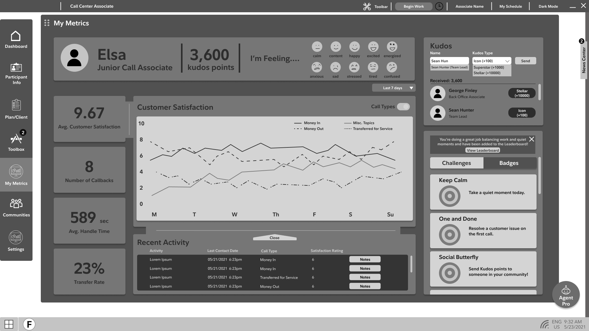
As seen above, the user has the option to expand the metrics view to see a more detailed breakdown of the data alongside their recent activity.
Visual Design
We had the opportunity to help finalize and implement the design system onto the wireframes. I learned a lot about transitioning our work from a wireframe to a real visual design that used a specific grid and spacing system, interactive components, and a style of iconography.
Below is the final visual design which includes icons, a method of accordion fold-outs, and a strategic use of focus and highlight outline colors to make the page visually fit in with the rest of the interface.
Displaying the sections as individual modules helped the metrics page unify better with the rest of the application as well.
Looking back
Looking back, we faced a lot of challenges, learned many lessons, and would do a few things differently if we had more time.
Right from the start, we were dropped into the middle of the project upon the start of the internship, so we had to become acquainted with a new internal and client team organization, understand the pain points of the existing interface and overall goal of the project, and begin working all at the same time.
I learned how there is often a disconnect between what the client thinks the associates want and what the associates truly want in a new system. This is why user testing is so important to confirm or deny any initial assumptions. Furthermore, we learned how valuable it is to take time to understand the context in which we're designing, so we could be as familiar to the associate journey as the users are.
If we had more time, it would've been great to have the opportunity to speak with associates more about how the metrics page impacts their role and what they would want to see in an improved version. Finally, we had some ideas about a smart system that could suggest specific trainings or make recommendations based on an associate's metrics, but we did not have much time to fully flesh out the idea.