Student Project: Create an interface for a website that contains an archive of material
YEAR
2020 (four weeks)
PLATFORM
Sketch
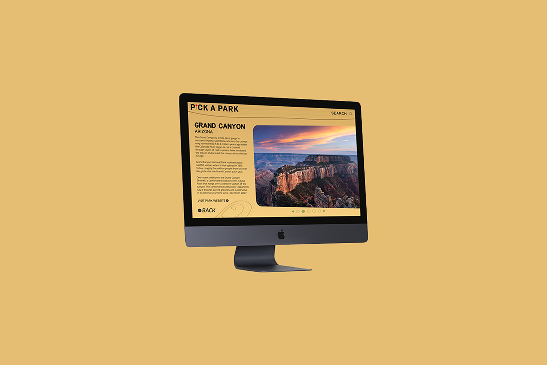
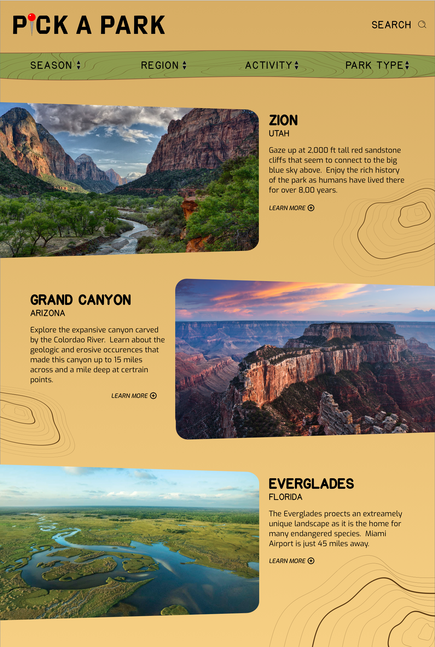
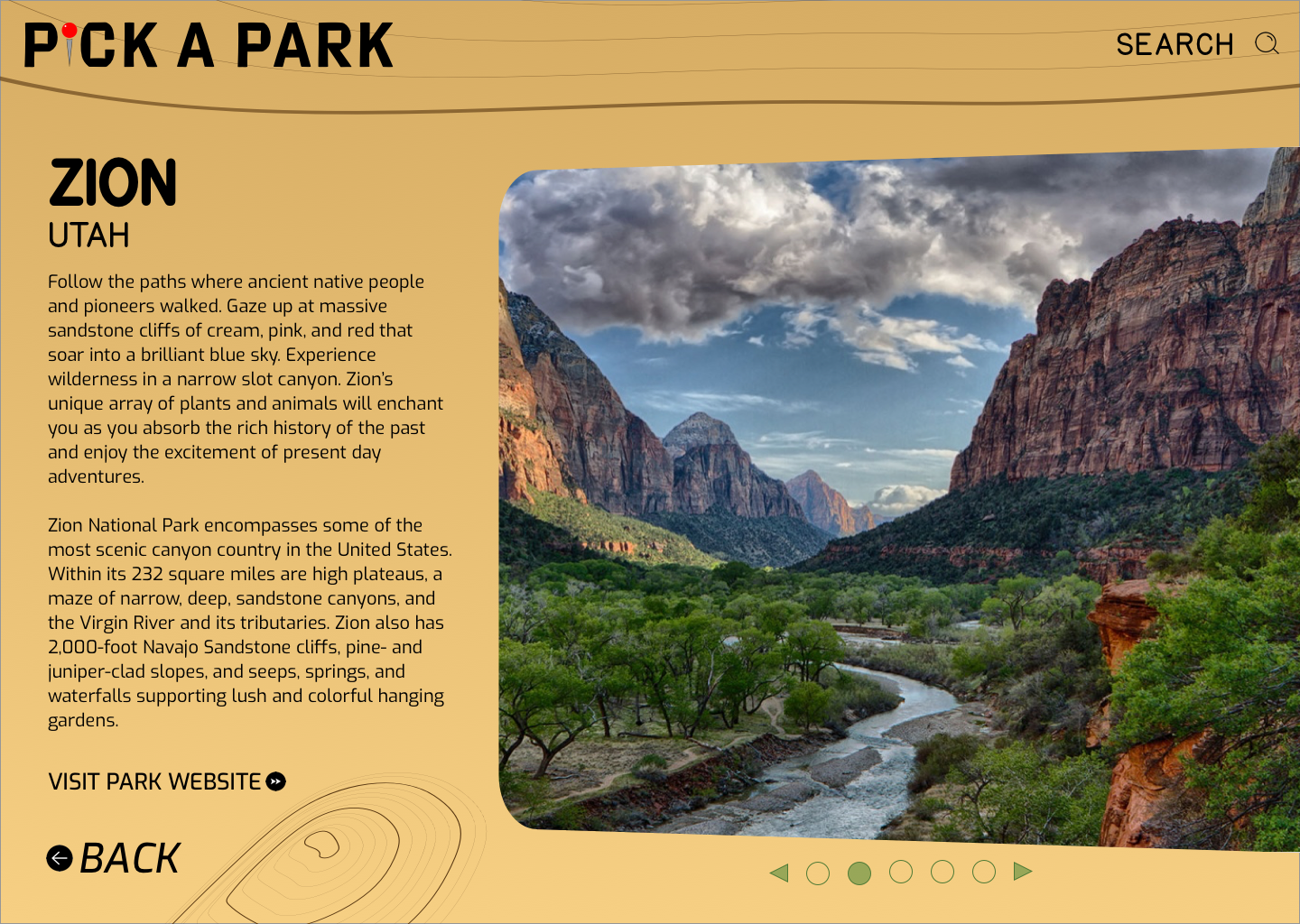
The website and experience that I created takes a simple approach of providing users with data about the US National Parks to encourage travel to and appreciation of the country's natural beauty. The users are easily "quizzed" to determine which of the 62 national parks are within their applicable travel zone. The parks are sorted by best season to visit, region, popular activities, and park types. Users can then simply scroll through their results and view information and images about each park.
RESEARCH
Initially, I reviewed various travel websites to see how relevant information was presented and organized and how the user could sort through it all. From this, I was able to decide the general route that a user would take on my website to maximize their experience.
WIREFRAMES AND DESIGN DIRECTIONS
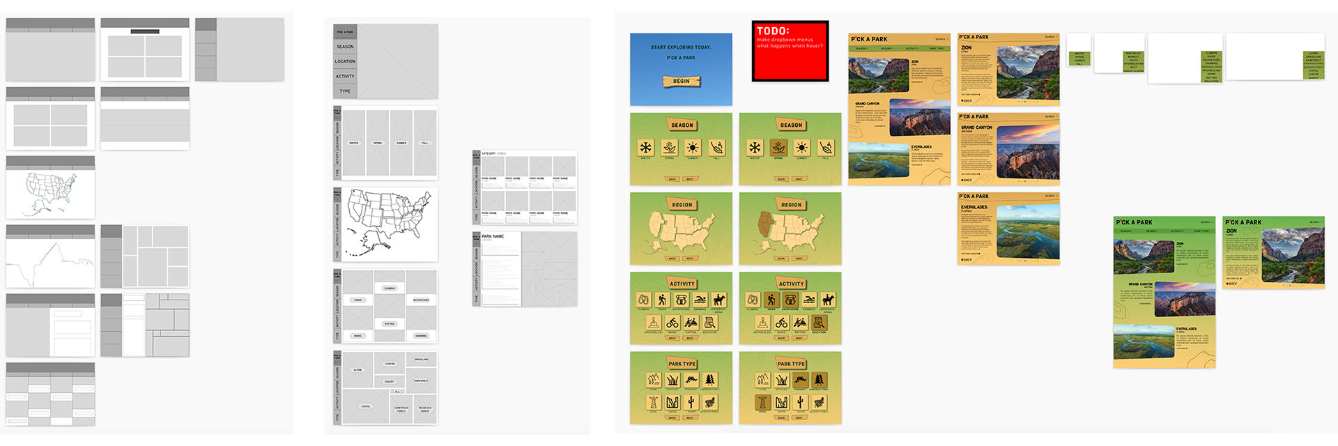
After sketching numerous very rough wireframes by hand, I chose several of my favorites that I converted into Sketch files. I experimented with the website layout and hierarchy, along with color schemes. The design would complement that of the National Parks. As an example, I utilized the same font used by the Parks, and I also borrowed the irregular shape of National Park entrance signs as frames for the images of the park (see interior pages).
FINAL DASHBOARD
The user easily completes a short "quiz" to better tailor results to their desires.
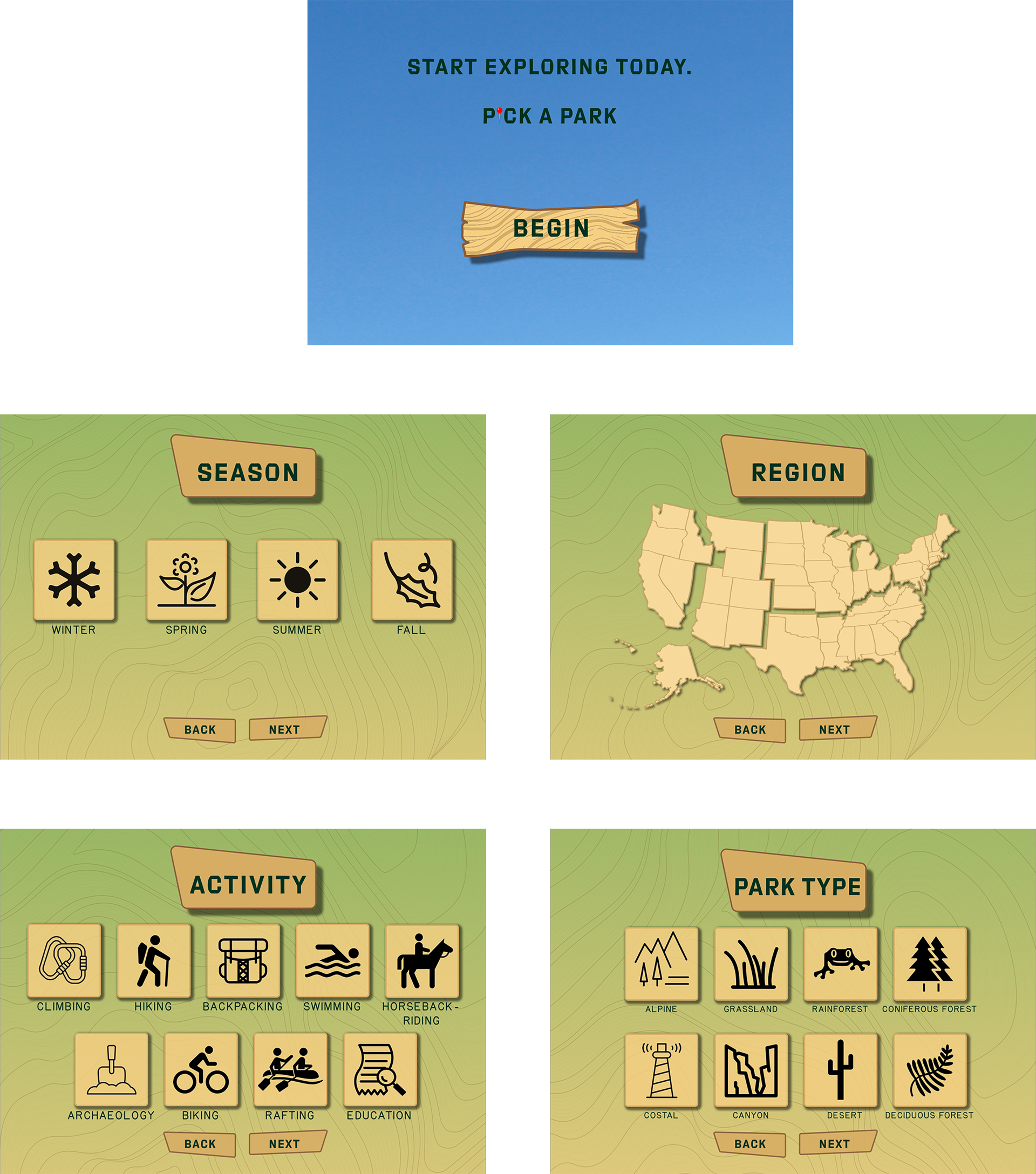
After completing the quiz, the user is taken to a selection page where they can view all of the parks meeting their specifications.